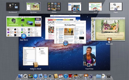
Mission Control
OS X Lion is a big step forward in personal computing, and, over the next few years, we are going to see a lot of our preconceptions about how computers work begin to melt away. Apple is setting a high bar for themselves and their developers. Lion is an ambitious release with ambitious goals that are going to take some time to actually come to fruition. However, as futuristic as Lion is, Mission Control feels like a step back.
One of the best features of the Mac since 10.3 been Exposé. Exposé became a part of my workflow so easily that I came to rely on it just by muscle memory. Exposé was always one of the gems of OS X that highlighted how different the mental model of using the computer was when compared to Windows. Unfortunately, with Lion, Apple decided to cut way back on the features that were available in Exposé and mash it together with Spaces. Spaces are Apple’s implementation of multiple desktops, a feature that UNIX and Linux desktops of had for decades. Spaces before 10.7 was fairly good, but I rarely used it.
One situation when I would use Spaces is during server patching. When patching servers it would not be unusual to have 20 or even 30 different terminal windows open at the same time, as well as a chat window, Mail, and Safari. With that many windows open at the same time I would use Exposé to keep track of them all, and I would use Spaces to keep all of the different terminal groups in their own space. On Snow Leopard and before you could activate Spaces, and then drag windows back and forth between Spaces even if you weren’t actually on the desktop that was active at the time. It didn’t matter, they were all equal.
Then, using Spaces’ 10,000 ft. view, you could see all of your Spaces, and all of your overlapping windows. It is interesting to note that this core functionality has not changed in Mission Control. Mission Control does still let you see all Spaces and all overlapping windows in them. In Exposé, the magic was that you could then hit the key command for Exposé and inside of each one of the Spaces, in real time, the windows would all zoom out into Exposé in each of their Spaces to give you a full view of every window in every space that you had opened. Exposé allowed you to drag-and-drop your individual windows between Spaces and watch as the windows in the new space automatically resized and rearranged to make room for the new arrival.
Mission control is almost Exposé; it does give you the ability to see different application windows, but what it takes away is the elegance of Exposé. Instead of a set of miniaturized windows, each a small, live updating thumbnail, mission control overlaps windows from the same application. Worse, applications windows overlap in the order they were used, which is wrong. If you think about it, when you are going into Exposé, you don’t want to see the application window you just used, you want to see the window that was active before you began using the window that you are currently in. I have always used Exposé to switch between tasks, not to switch between applications.
Also gone from Mission Control is the live nature of Spaces. You can only interact with the space you are currently in, you cannot interact with any other open space, except to switch to that space. That is a step back, no matter how you look at.
I can understand why some things needed to change and Spaces. In Lion, the three finger swipe gesture between Spaces would not have worked with Snow Leopard’s implementation of Spaces. With Snow Leopard, Spaces occupied a two-dimensional graph, both horizontal and vertical. Spaces could be either up or down, or left or right. In Lion, Spaces are only horizontal. This works because the best way to move between Spaces is the three finger swipe from left to right, or from right to left. On Snow Leopard Spaces, to be able to use gestures, you would also have to be able to recognize a three finger swipe up for the space above, and a three finger swipe down for the space below. In Lion, those gestures are already accounted for. Not to say that it could not work, but I could see users becoming easily disoriented as to which space they were in, and which way they should be swiping. With Mission Control, when you reach the end of available Spaces, the desktop bounces slightly, a move clearly reminiscent of iOS. However, what does not make sense to me why Apple decided to change Exposé in a way that is clearly inferior.
With that being said, I love the three-finger swipe gesture to activate Mission Control, but I do wish I could see the full Exposé. I find myself using Spaces a more now than I ever did before. I do not use them as additional desktops but I do always have a space open for iCal, another for iTunes, and maybe another for mail. It’s good to see improvements in Spaces, but it is unfortunate the improvements had to come the cost of the most sophisticated window management system on any platform.
