Open Source News Design
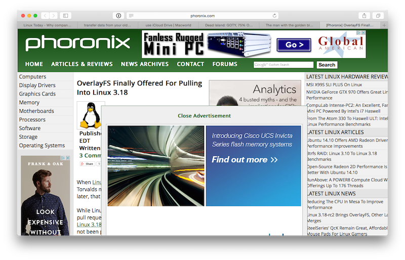
Finding good design in open source can be hard, but it’s almost impossible to find in open source news sites. These sites take “reader hostile” to a new level. Take example “A”, Phoronix:

The advertisement completely obstructs the text. Once the ad is closed, which I’m assuming counts as a “click”, the site is not too terrible to read. Of course, it’s no Daring Fireball.
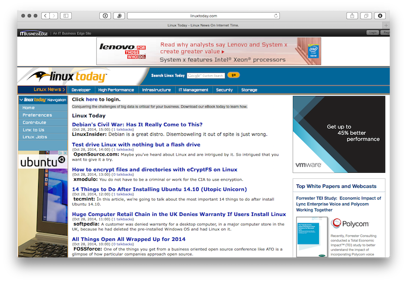
The problem is compounded when using an aggregator site like Linux Today. Initially, it looks like a series of links:

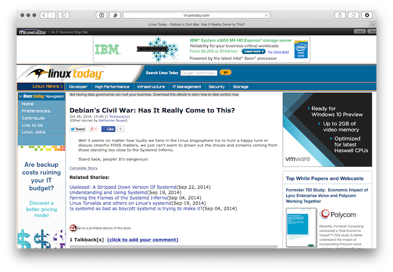
But, as soon as you click on a link, another full screen, text obstructing ad appears.

OK, fine, close the ad, and see that you still have another link to click on to get to the article you want to read.

Now I’m wondering just how much I care about the Debian Civil War (spoiler: not much), but by this time, I’m invested, let’s read that article. Click the Complete Story link.

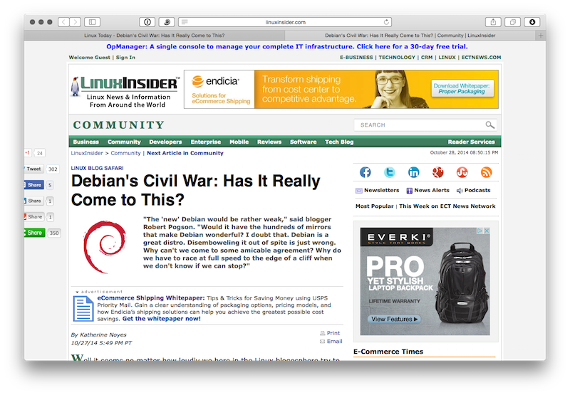
Nope! Close the ad, and, finally, find the text I was looking for.

Has it really come to this? Apparently.